Tuesday, February 17, 2015
Thursday, February 12, 2015
Rice Krispies Final Product
SNAP, CRACKLE, POP! A party in every bite... Rice Krispies are best known for their icon "snap", "crackle", and "pop" when milk is added. Rice Krispies are not only a good breakfast cereal, but also for a late night snack. You can even use them to make the always-popular Rice Krispy Treats to take to a party. Whether eating it for breakfast with the family or out late with friends, it's always a good choice.
This design for this product is based off the neon colors and black backgrounds you would normally find at a party. The hand lettering and sporadic text gives it a down-to-earth and fun feel. On the blue tabs on the top and bottom you will find blurred lights to emulate those of a disco ball. The flowing blue letters in the background add another depth and really push the overall feel off energy portrayed in this design.
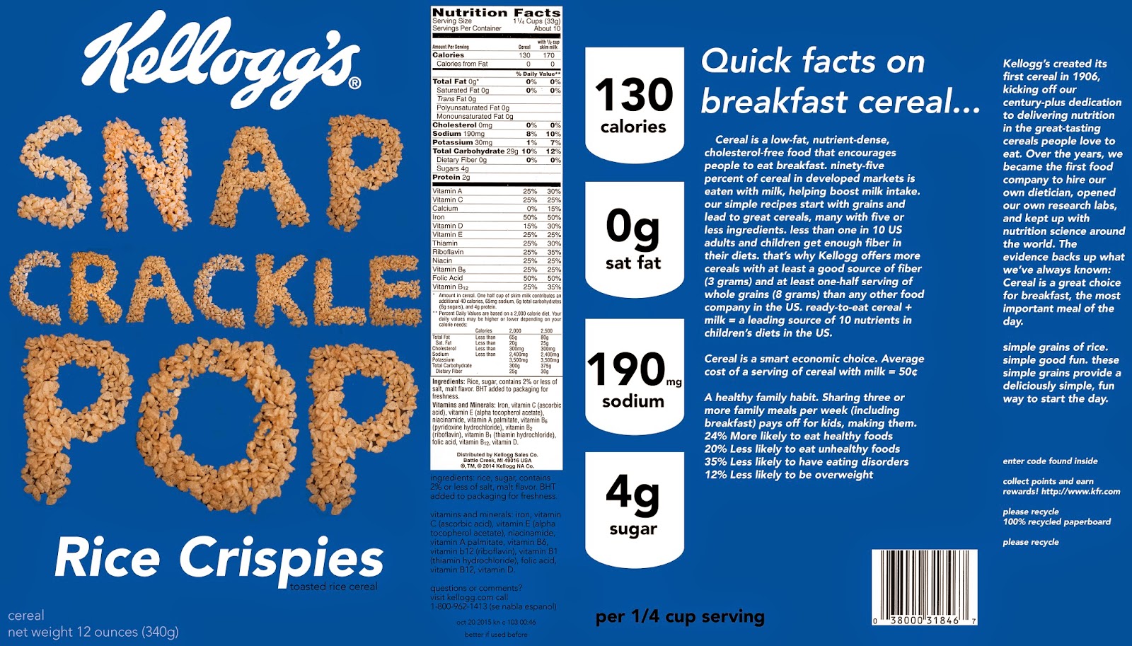
The green cereal box is informational and the blue one is also based off energy, but is also somewhat interdependent.
Tuesday, February 10, 2015
Tuesday, February 3, 2015
Thursday, January 29, 2015
Tuesday, January 27, 2015
Thursday, January 22, 2015
David Carson-Ted Talks
David Carson talks about re-inventing design to push boundaries of intuition. He states that following one's intuition can not be taught, specifically in design, but is a vital part of creating something appealing and useful. Carson talks about emotions sent and received through a design. He uses the example of 2 garage doors, one with printed letters saying "no parking" and the other saying the exact same words but written in spray paint and underlined three times. Carson uses humor throughout his speech to make certain points about design. Most of these things are ironic points of interest, including the 5th printing of a book titled "The End of Print", an exhibit about photography being the end of painting, and minimal graffiti on a minimal street sign. One of the strongest points he made was that legibility is not the same as good communication. In the People magazine from 9/11, Carson speaks to the bad design of the terror story combined with the ads, and how they negatively affected one another. Overall he criticizes, evaluates, and jokes about every aspect of design and their unintentional irony.
Subscribe to:
Posts (Atom)